Video Analytics & Optimization Dashboard (Figma Design)
This Figma design presents MediPulse, a dashboard that empowers healthcare creators to analyze video performance and optimize content for better engagement. It combines intuitive metrics with actionable tools to improve visibility and relevance in the health media space.
🔍 Analytics Overview
The Analytics Page provides comprehensive insights into a channel's performance over time:
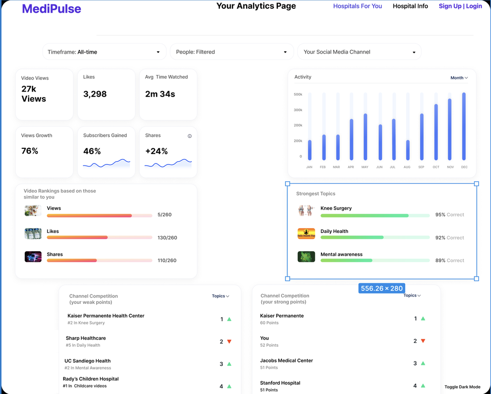
What it provides:
- Key metrics like total views, likes, average watch time, view growth, subscriber gain, and shares.
- Activity trends over time (monthly bar graph).
- Strength analysis of top-performing topics like Knee Surgery and Daily Health.
- Competitive rankings vs. similar healthcare creators.
- Channel strengths and weaknesses with up/down movement tracking.
Why it's useful:
- Helps creators understand what content resonates most.
- Identifies opportunities for improvement by comparing weak vs. strong topic areas.
- Visualizes performance trends to guide content strategy.
🛠 Video Optimization
The Optimize Your Vid section supports content planning and publishing with a focus on relevance and performance:
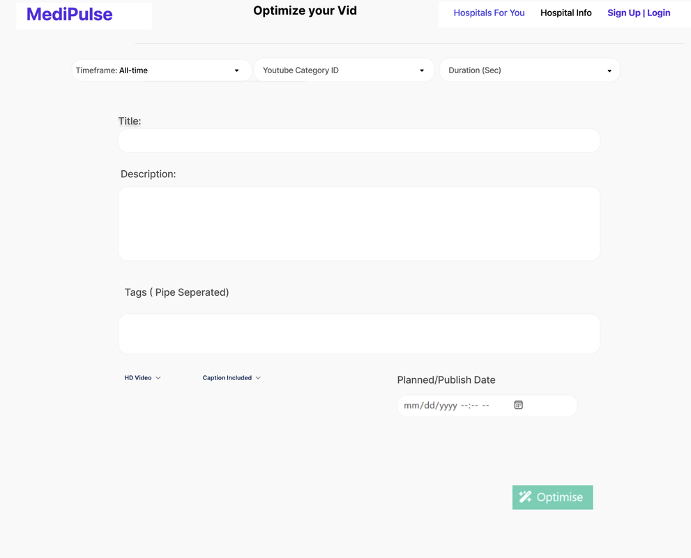
What it provides:
- Fields to input title, description, tags, and publish date.
- Filter options: timeframe, category, and video duration.
- Toggles for HD video quality and caption inclusion.
- One-click "Optimize" button to finalize enhancements.
Why it's useful:
- Ensures videos are well-structured and aligned with viewer interests.
- Streamlines metadata entry and publishing setup.
- Increases the likelihood of discoverability and audience engagement.
This comprehensive dashboard design provides healthcare creators with the tools and insights needed to optimize their content strategy and maximize audience engagement through data-driven decision making.